I’m rubi, a PhD candidate in human-centered design team at UTwente with a drive for social growth
Discursive design
Debating Energy Futures' Justice
In the face of the growing climate crisis and its impact on the environment, the design field has taken on the responsibility of mitigating the effects of new products. However, the social impact of the energy transition has often been overlooked. This project aims to address this issue by creating a participatory design investigation that sparks debate about justice in energy futures. Through the creation of fictional artifacts, this work explores an energy scenario for Switzerland in 2030 and engages the audience in discussions about the social implications of this future.
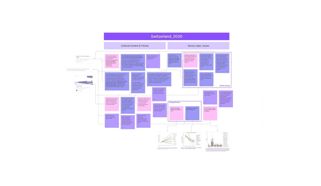
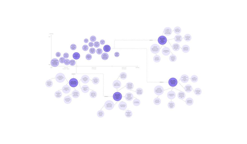
To inform the envisioning of a plausible future scenario, extensive research was conducted using a combination of desk research and context mapping activities. The scenario was grounded in academic knowledge, industry trends, and institutional reports and policies related to energy production and consumption. The scenario took into account Switzerland's commitment to reducing greenhouse gas emissions as part of the Paris Climate Agreement by 2050. Insights into energy-storing technologies and their potential impact on social inequality were gained through interviews with experts in the renewable energy sector. These insights were further analyzed using the Societal, Technological, Economical, Environmental, and Political (STEEP) framework.

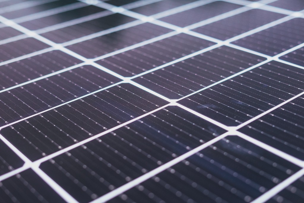
Something that not a lot of people know is that what Switzerland signed with the Paris Agreement isn’t only that every house should produce energy in 2050 but also that every household needs to be autonomous in their electricity consumption.
In the envisioned scenario for 2030 Switzerland, emerging from the research phase, the government imposes a maximum energy quota for each household to address environmental challenges and encourage energy conservation. However, this policy leads to certain everyday activities becoming luxuries due to limited energy availability. The industry responds by introducing highly efficient energy-storing products to mitigate excess energy produced by solar panels and pressure on smart grids. Unfortunately, these technologies come at high costs and create economic disparities, exacerbating social divisions within communities.
To bridge the gap between abstract energy discussions and the intricate realities of everyday life, the scenario was brought to life through the creation of two fictional artifacts. These artifacts serve as prototypes that visually represent the complexities and potential social divisions arising from the energy transition. Rather than being fully functional prototypes, they are presented in two videos that describe the two alternative social contexts in which these artifacts would exist.
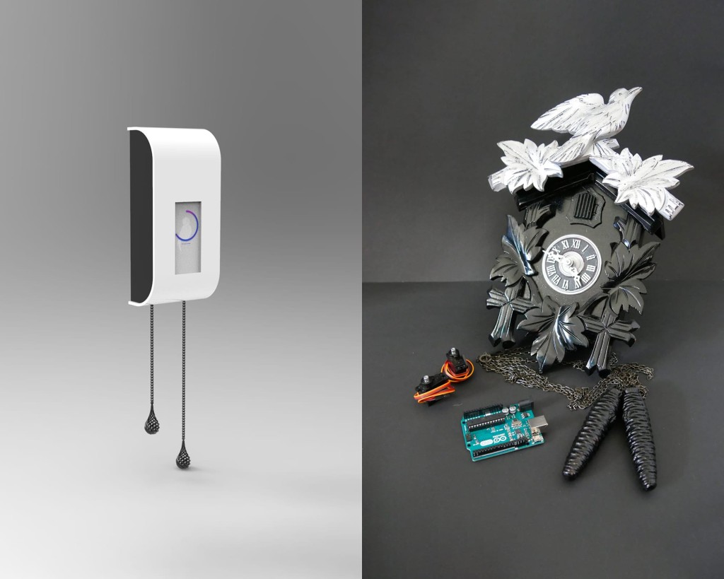
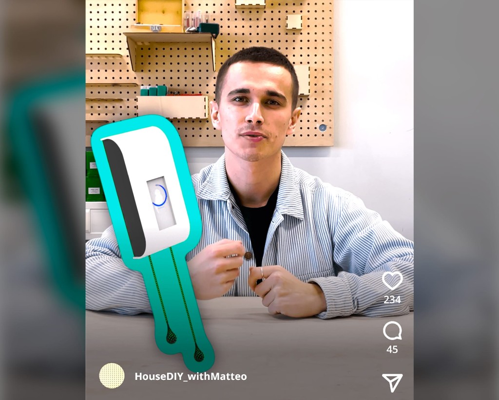
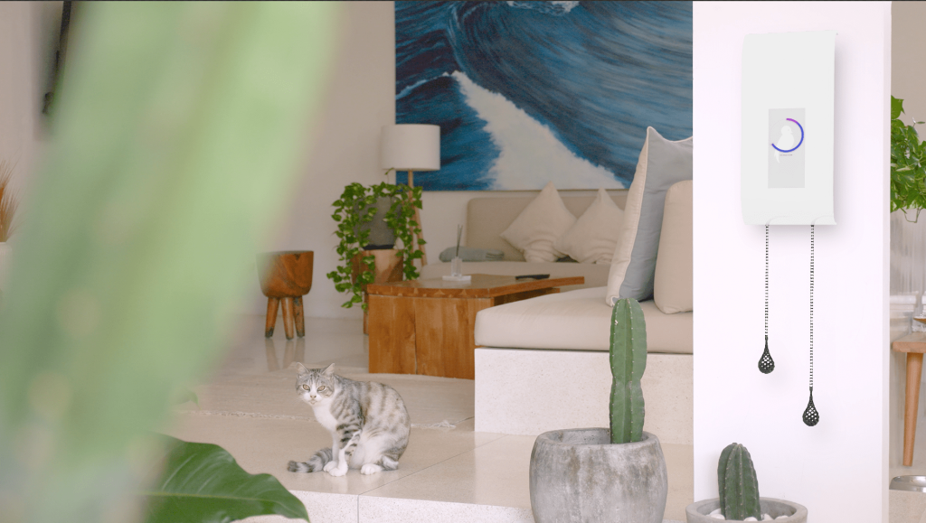
Speculating through design by presenting abstract issues and fictional products enables us to explore ethical and social issues within the context of everyday life.
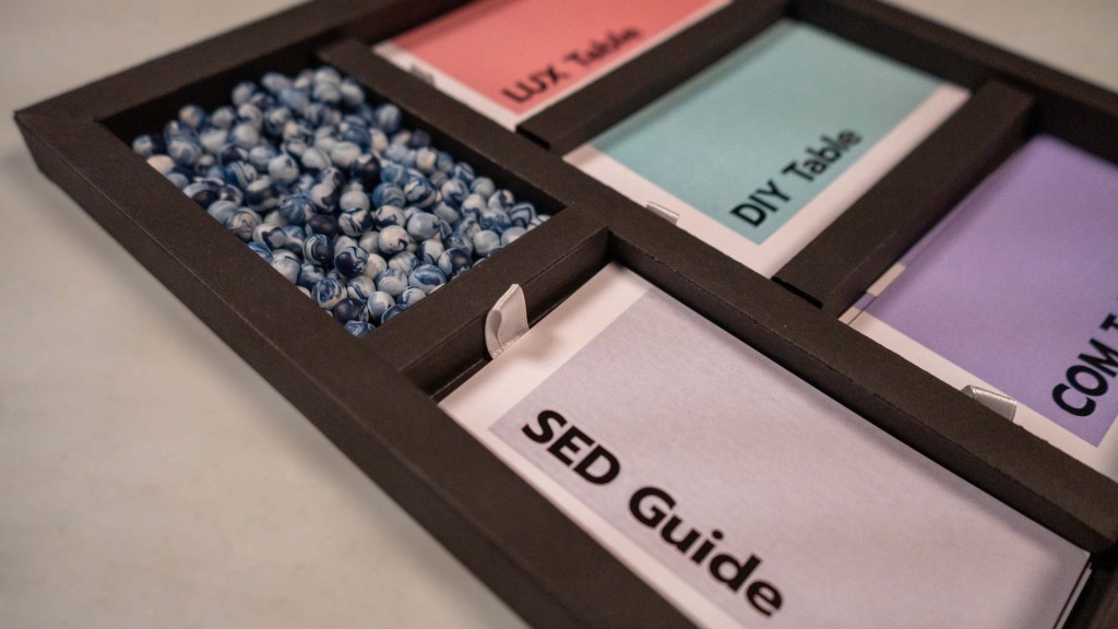
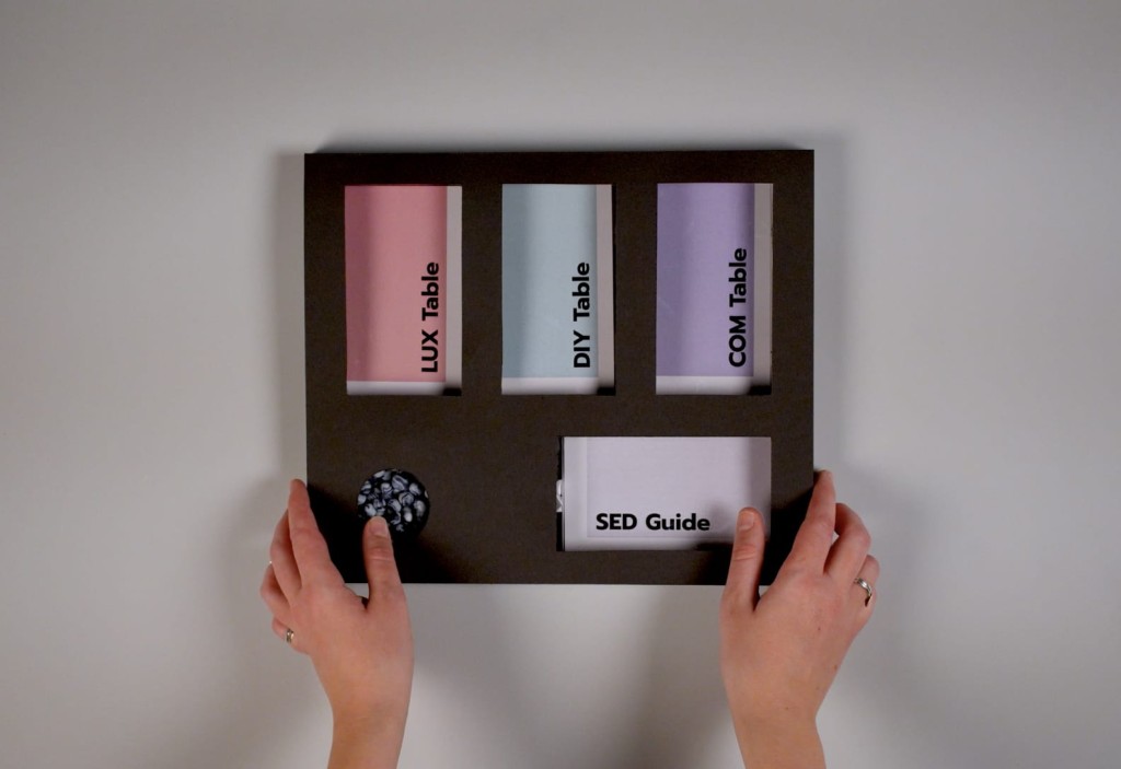
In addition to the fictional artifacts, a participatory toolkit called SED (Social & Energy Debate) was created to facilitate interactive sessions aimed at confronting and debating the potential ramifications of the energy transition. The SED toolkit was inspired by the world café methodology (Löhr et al., 2020) and served as the foundation for a public event. The event welcomed twelve participants of diverse ages, genders, and nationalities.
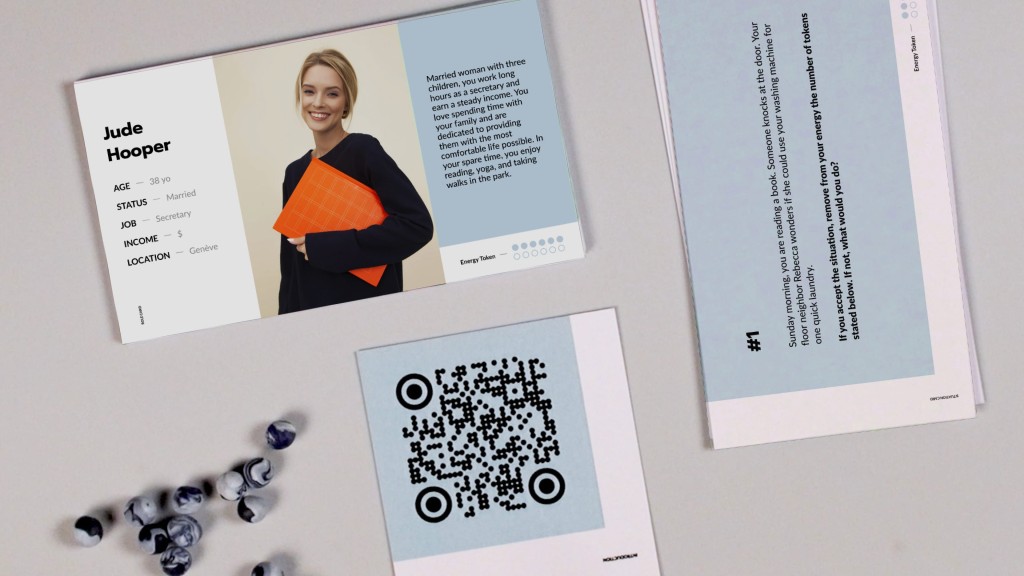
The SED toolkit guided participants through three main elements:
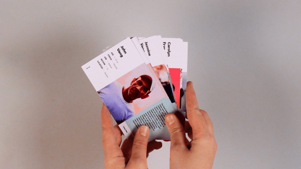
Role cards: Each participant was assigned a role through these cards, inviting them to embody a particular persona. The role cards provided diverse profiles based on factors such as age, job, and income, offering different social perspectives.
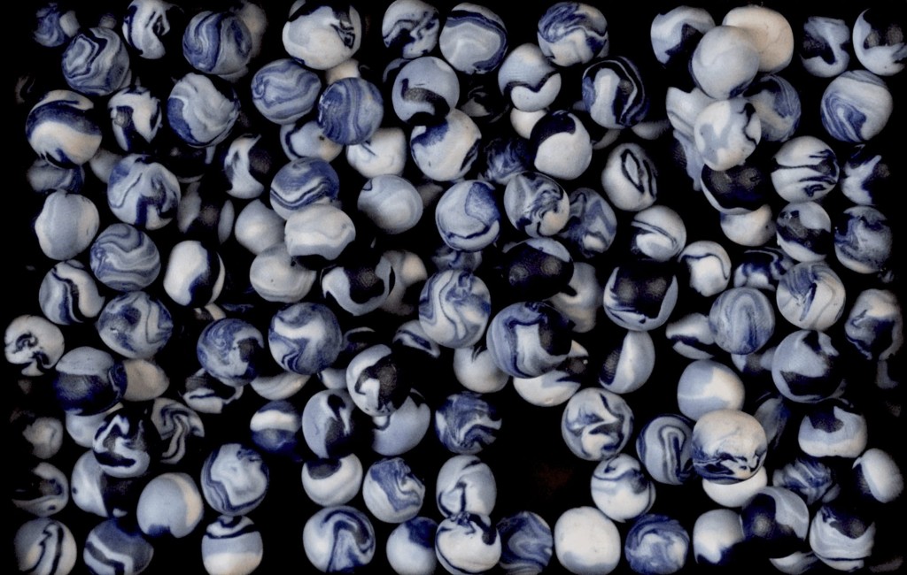
Energy tokens: Physical representations of energy, the tokens were distributed to participants based on the social status of the persona described in their role cards. Different incomes and access to resources like solar panels, light, or efficient batteries determined the quantity of energy tokens allocated. For instance, personas in the luxurious social group received between six to twelve energy tokens, while those in the less wealthy social group, associated with the DIY device, had between three and six tokens.
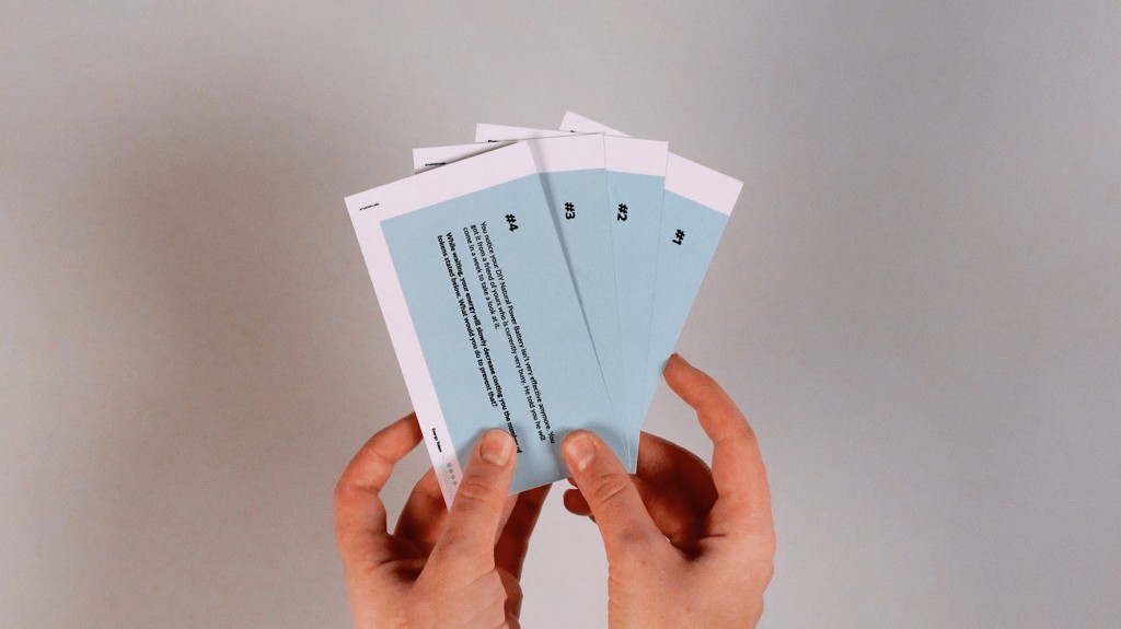
Situation cards: These cards presented challenges that would impact participants' social status, and solving each situation required a certain number of energy tokens. Deliberately, participants would not possess enough energy tokens to resolve all situations, necessitating assistance from others. This design aimed to explore participants' reactions when sharing energy with individuals of the same or different social statuses.
The participatory session incorporated an introduction, conversation tables, and a vernissage. The introduction provided participants with a textual description of the future energy scenario, complemented by the two videos showcasing the fictional artifacts. The conversation tables facilitated discussions on energy futures, with one table focusing on envisioning worst-case scenarios, while the others engaged in hands-on activities to explore energy futures for different social statuses. The session concluded with participants sharing their key insights and takeaways from the event.
The study highlighted the importance of materializing intangible concepts like energy and the value of using perspective-taking tools for research purposes. It also revealed challenges in the process, such as initial confusion among participants and the need for clear intentions and trial rounds. Future studies could focus on examining social behavior patterns across different groups with varying social statuses and expand the diversity and reflection within the role cards. By creating spaces for collective reflection and confrontation, projects like this have the potential to inspire the public to take action toward desirable changes in energy futures.
MULTIMODAL UX
Fabi - Assistant Buddy
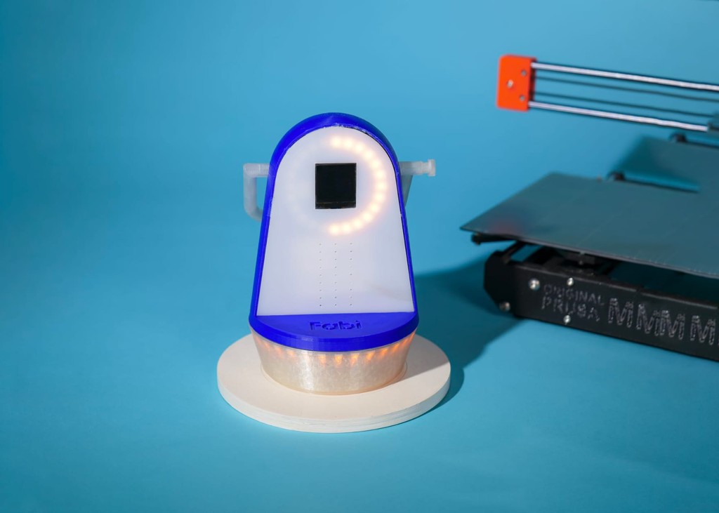
In an era characterized by rapid technological evolution, crafting user experiences that seamlessly integrate intelligent agents across diverse interaction modalities is imperative. Recognizing this challenge, our project, Fabi - Assistant Buddy, undertaken in collaboration with FabLab SUPSI, sought to explore the profound impact of Multimodal User Experience (UX) on learning environments, particularly within the context of FabLab settings. Through a five-week endeavor, our team embarked on a journey to not only develop a tangible solution but also to uncover the underlying importance of Multimodal UX in addressing the complexities of modern educational spaces.
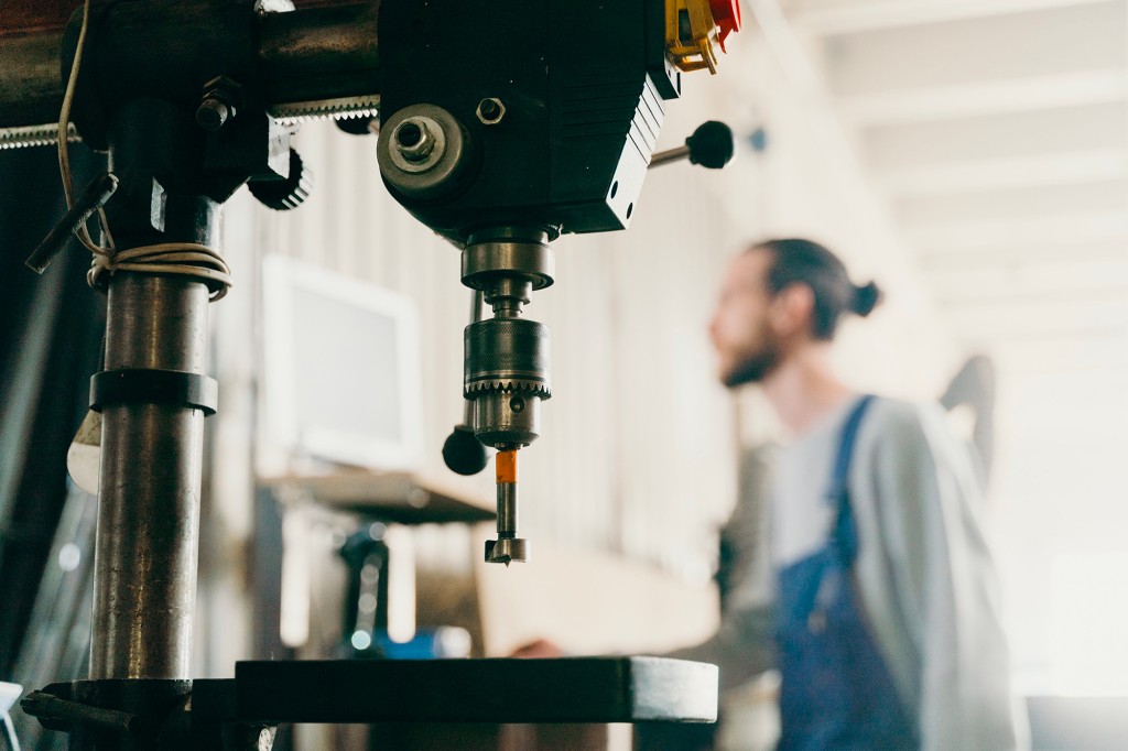
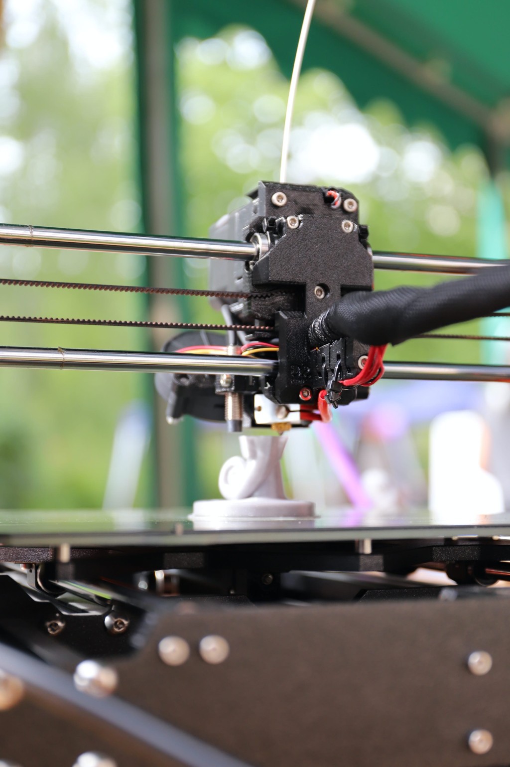
Through thorough desk research, we meticulously identified three primary opportunity domains: Smart objects, Smart space, and AR/VR, each boasting diverse applications encompassing communication, workshops, and machinery/tool management. To further unravel these prospects, we meticulously scrutinized several projects exemplifying each domain.
In our quest to grasp the nuanced needs of our target audience, we meticulously crafted two distinctive archetypes: the seasoned explorer, driven to expand their existing knowledge, and the novice, venturing into the FabLab realm with a thirst for learning. Employing a multifaceted research approach, we embarked on four distinct methodologies. An exhaustive online survey furnished quantitative insights into students' space utilization patterns and knowledge levels. Complementing this, in-depth interviews provided rich qualitative data, unveiling critical pain points. Augmenting our understanding, both online and on-site observational studies afforded invaluable perspectives into prevalent challenges and student encounters within the FabLab ecosystem. From these comprehensive findings, we delineated seven discernible realms of information, notably spotlighting the "Potential of the lab" and the "Perception of the lab," shedding light on students' perceptions vis-à-vis the lab's intended purpose and utilization. Furthermore, our investigations underscored the pivotal role of external communication in shaping students' perceptions and engagement with the FabLab.
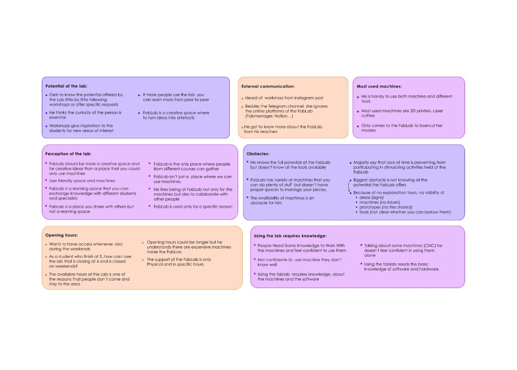
FabLab should be more a space for creativity and ideas than a place that you could only use
machines.
Synthesizing our findings, we discerned three foundational pillars demanding attention: bolstering student confidence, igniting novice engagement, and fostering inclusive community dynamics within the FabLab milieu. These pillars encapsulated the essence of our endeavor—to bridge the chasm between aspiration and reality, cultivating an environment where every user thrives. As we embarked on the journey to conceptualize Fabi, our guiding beacon, we recognized its potential to serve as a catalyst for transformative change within FabLabs globally.
In crafting Fabi, our aim transcended mere functionality; we sought to imbue it with an ethos of empowerment and accessibility. By leveraging Multimodal UX principles, Fabi emerged not merely as an assistant but as a conduit for unlocking untapped potential and dismantling barriers to learning. Through meticulous iteration and refinement, we endeavored to manifest our vision—a vision wherein technology becomes an enabler, seamlessly augmenting human capability and enriching the fabric of educational experiences.
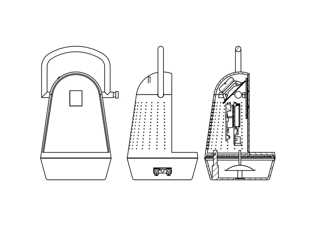
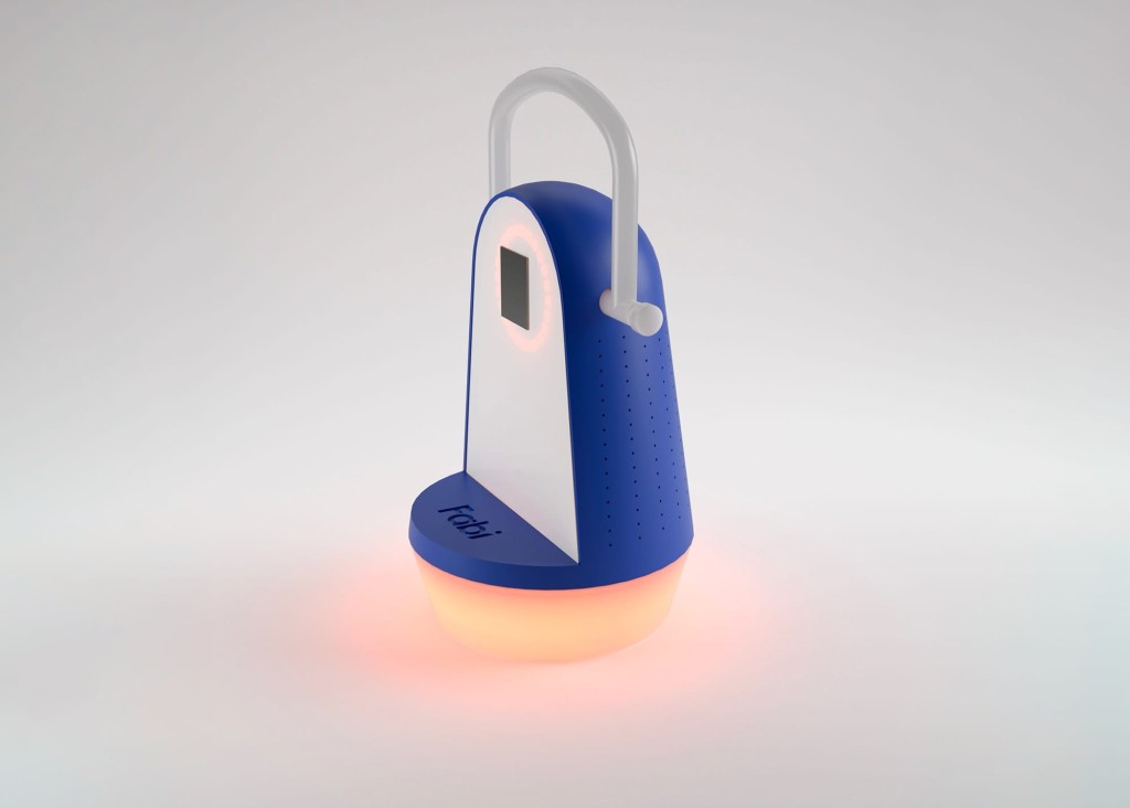
During the development phase, our team embarked on a journey marked by technical ingenuity and collaborative synergy. Divided into specialized sub-teams, we orchestrated the convergence of design, hardware integration, and graphical interface development to bring Fabi to life.
Two of our teammates dedicated their expertise to ensuring seamless integration with hardware components. Their iterative process, informed by rigorous testing with 3D-printed prototypes, culminated in the distinctive lantern-shaped form factor for Fabi. Carefully selected materials and color schemes were not merely aesthetic choices but strategic decisions aimed at optimizing light feedback distribution and sound resonance within the device.
Meanwhile, meticulous attention to detail characterized the development of Fabi's hardware architecture. Leveraging Arduino tools and a carefully planned component positioning strategy, we optimized the placement of various components, with a particular focus on the speaker's precise positioning to harness the product's casing for enhanced sound resonance. Most notably, our team navigated the intricacies of programming with Arduino C++, crafting every interaction to ensure seamless user engagement and operational efficiency.
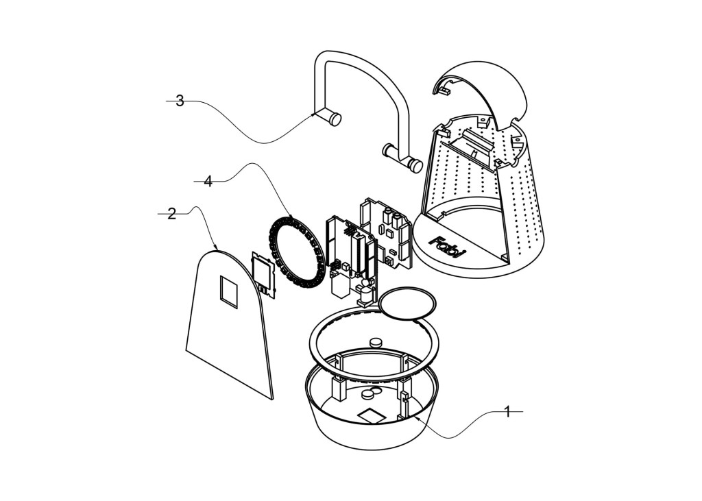
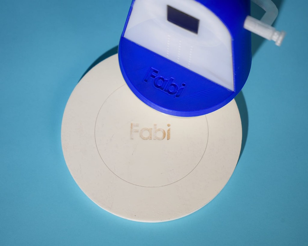
The operational prowess of Fabi unfolds through a symphony of technical intricacies meticulously engineered to deliver a seamless user experience. Upon placement at one of the ten designated FabLab stations, Fabi seamlessly initiates its interaction protocol, downloading pertinent datasets to stand ready for user queries. In our prototype, this interaction choreography was simulated through a magnet placed within the station, promptly detected by a magnet sensor embedded within Fabi.
A testament to meticulous design, Fabi engages users through a multi-tiered interaction hierarchy. As users initiate queries, Fabi's responsive NeoPixel ring illuminates, visually signaling data retrieval and processing. Concurrently, Fabi's voice interface seamlessly delivers vocal responses, complemented by QR code generation for further exploration of topics. Furthermore, Fabi's spatial awareness extends to tool localization queries, with corresponding station LEDs dynamically illuminating to guide users to their desired resources. This meticulously orchestrated interplay of hardware and software components embodies Fabi's commitment to operational excellence and user-centric design.
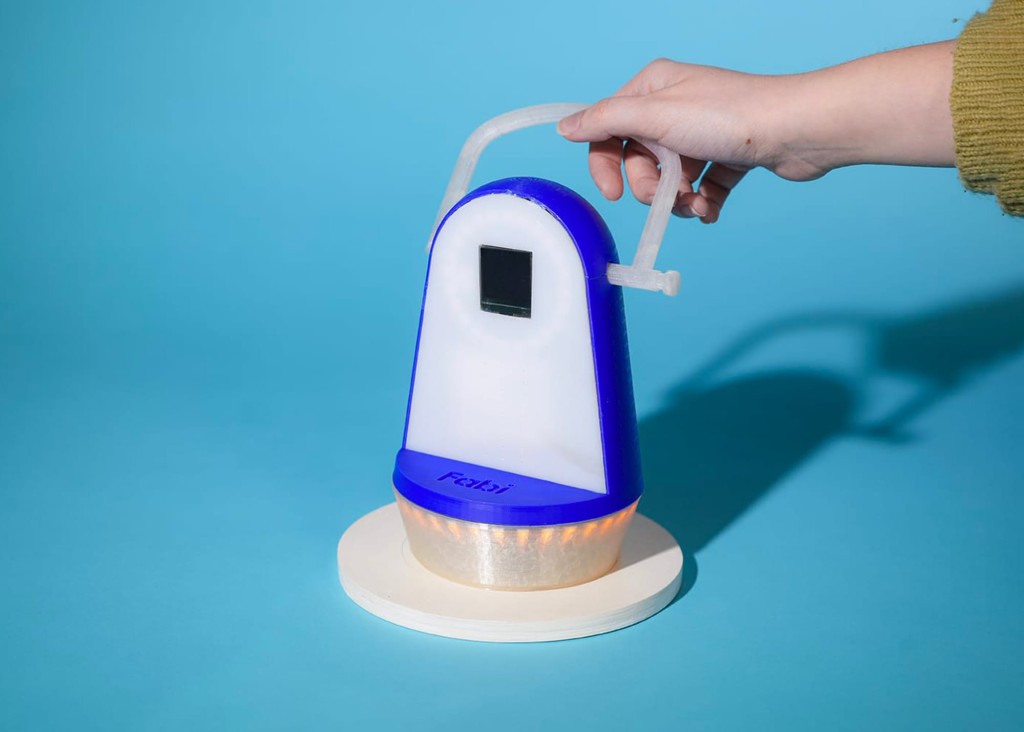
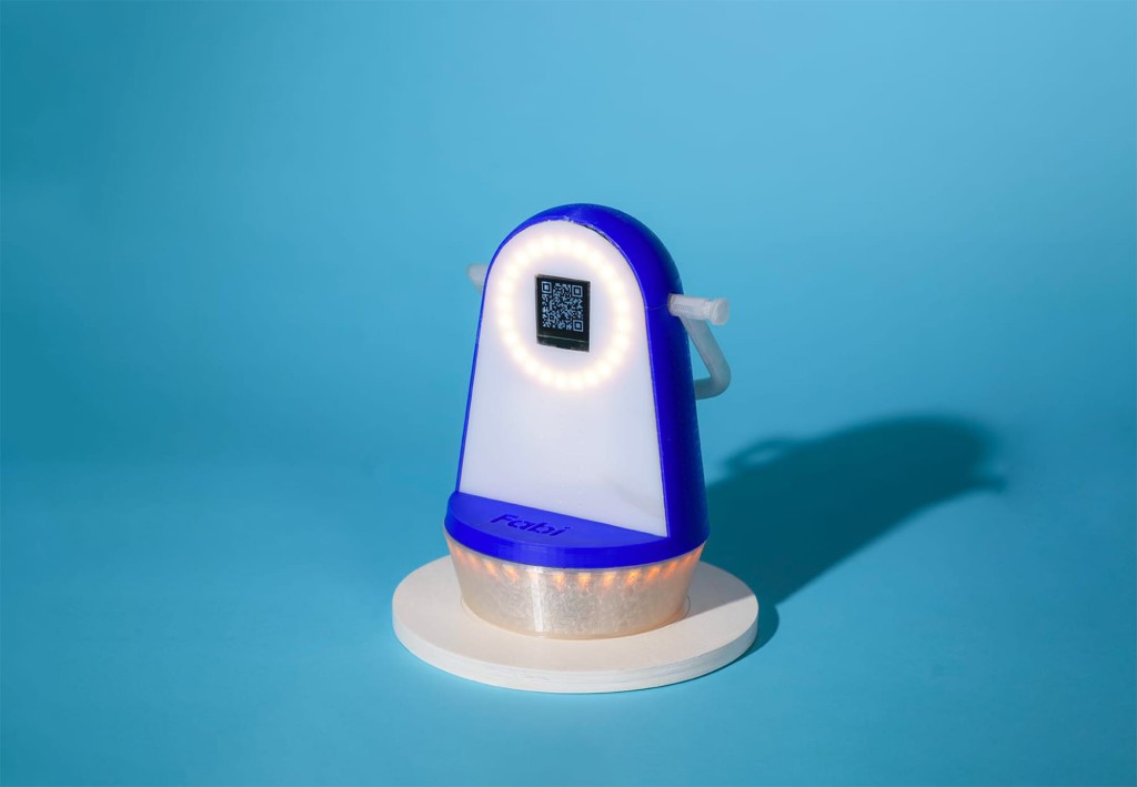
As we reflect on the journey of Fabi, it becomes evident that Multimodal UX represents more than just a design paradigm—it is an enabler of enhanced learning experiences and community engagement within FabLab environments. With its potential to transcend geographical boundaries, Fabi stands poised to empower individuals worldwide, transforming FabLabs into vibrant hubs of creativity, exploration, and collaboration. Through our endeavor, we have not only pioneered a tangible solution but also underscored the profound significance of Multimodal UX in navigating the complexities of our digital age.
Machine Learning
Neutrōm.otf
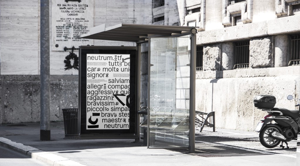
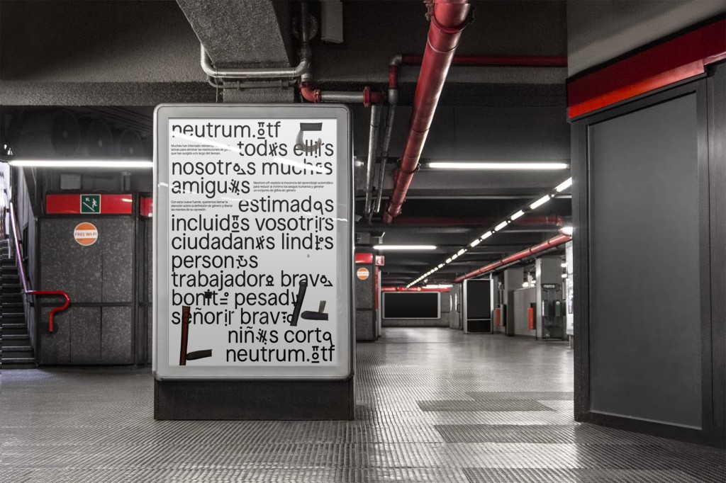
Many people have taken up the challenge of reimagining Latin-based languages in order to address the gender constraints that have arisen over time. Neutrum.otf leverages the innocence of machine learning to minimize human biases and create a set of gender-neutral glyphs. Through this groundbreaking font, our goal is to draw attention to the concept of gender and emancipate individuals from its oppressive nature.
Inclusive language encompasses a linguistic approach that upholds respect, acceptance and the inherent worth of every individual. Its essence lies in effective and considerate communication that is accessible to all while valuing, embracing, and empowering every member of the audience.
Inclusive language, as it stands today, employs glyphs as a means to replace the gender-specific components of words, thus striving for a gender-neutral expression. However, the glyphs we are discussing serve a distinct purpose in going beyond the current practices of inclusive language. Currently, individuals employ various symbols such as '_ * @ ə x in their written text to circumvent gender definitions.
Our intention was to harness the untainted potential of Machine Learning to minimize human biases and create a collection of genderless glyphs that could replace the currently used ones. It is important to acknowledge that, despite our efforts, we could not entirely eliminate the human factor in this process. We were responsible for selecting the glyphs, both for our dataset and determining the most suitable ones based on the algorithm's training outcomes.
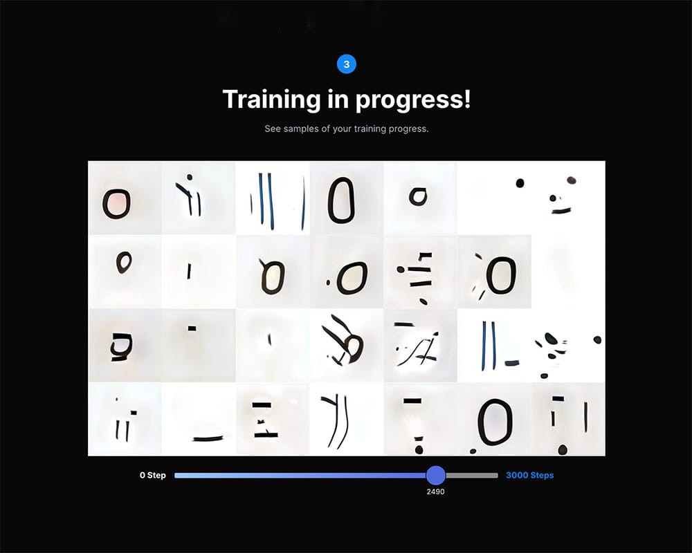
We gathered a dataset consisting of 802 glyphs, carefully selecting them and swiftly exporting them in the appropriate size and format using Python. This dataset served as the training material for our ML GAN model in Runway, enabling us to generate a new model. From the generated output, we exported 1000 glyphs.
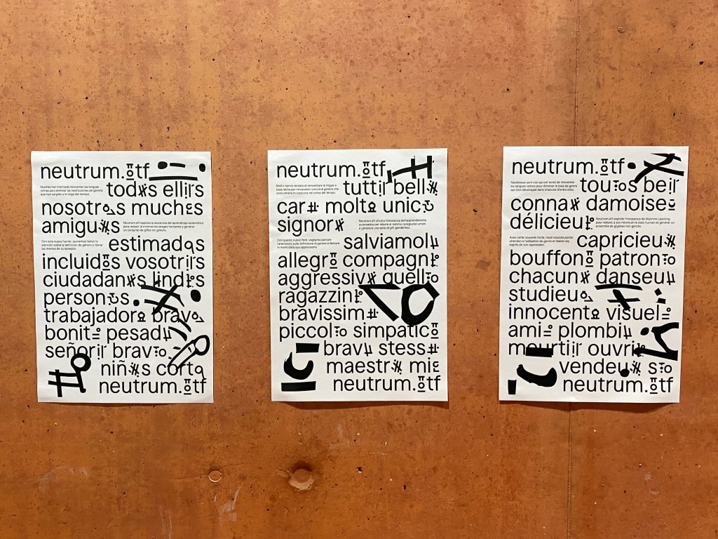
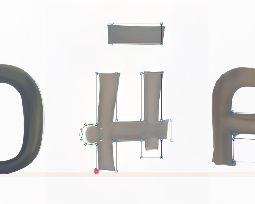
Among the exported glyphs, we handpicked 15 that exhibited the most neutral characteristics. We then proceeded to vectorize them and incorporate them into a font. These glyphs can serve as an alternative to the asterisk (*) symbol, forming a distinct stylistic set.
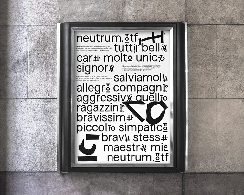
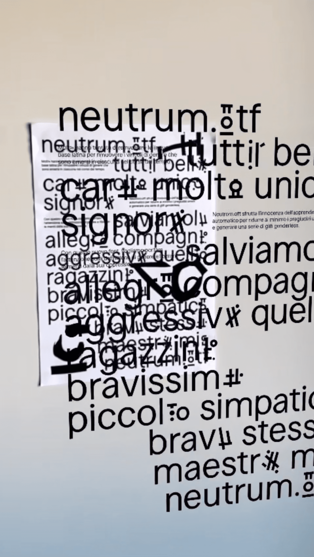
As a result, we produced three posters, each representing a different Latin-based language with gender-defined words. Our objective is to elevate awareness regarding the impact of gender definitions and liberate minds from the oppressive nature of such constraints. To enhance the immersive experience of the printed posters, we have incorporated an augmented reality (AR) application. This additional feature is designed to pique curiosity and generate further interest in our message, amplifying its reach and impact.
Our project's objective is not to revolutionize Latin languages but rather to shed light on this issue and foster open-mindedness among individuals.
UX Strategy
Redefining Job Application
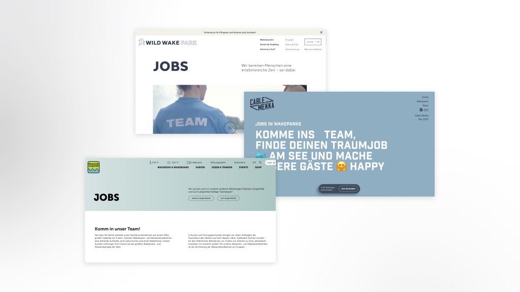
Ohaey is a startup creative agency located in Germany, offering a range of services including digital solutions, marketing, print materials, and event management, among others. Their client base spans various industries, from board sports to wine retailers.
They recently introduced an innovative approach to streamline the job application process and enhance employer branding for one of their clients. Recognizing the potential value of this solution for additional clients, I was brought in as a consultant to collaborate with their team for a week. During this period, I evaluated the product and provided comprehensive feedback encompassing the user experience, spanning from the applicant's perspective to that of the recruiter.
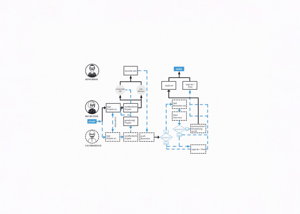
This product aims to enhance the experience for both job applicants and recruiters. I initially researched into the target audience, which comprises Ohaey's existing clients—mostly mid-sized companies with a workforce ranging from 10 to 400 employees. These companies primarily seek seasonal positions and typically focus on lower-responsibility roles through their digital platforms.
Additionally, I conducted thorough desktop research to explore similar firms and unrelated digital platforms for insights and inspiration. This research revealed the standard information required for job applications, innovative methods for filtering job listings, and examples of engaging visual elements.
“I hate classic application forms, I don’t have time to read them all and it's hard to get an idea of who the person is and if they would fit our vibe.”
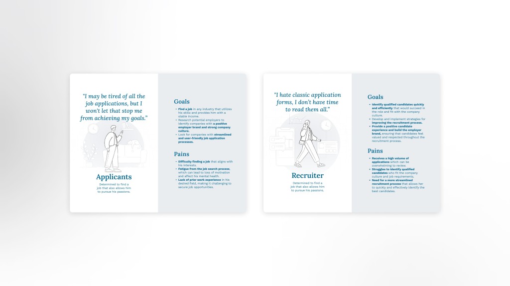
Given the project's time constraints, I prioritized efficiency. To augment my research within the tight schedule, I conducted qualitative data gathering through ten in-depth interviews. Of these interviews, five involved recruiters, while five involved job applicants. The insights gleaned indicated that recruiters often consider their primary mission as assessing whether an applicant aligns with the company's culture. They expressed a common sentiment that traditional application forms are difficult to digest and fail to meet their need to gauge candidates effectively. Moreover, in organizations with multiple departments, recruiters frequently lose track of applications that need to be passed on.
This latter insight on the recruiter's perspective sheds light on a significant pain point observed among job applicants. The interviewees frequently mentioned their demotivation to apply for positions due to receiving minimal or no response. Another challenge they faced was effectively demonstrating their suitability for a company while having to tailor each application to specific organizations.
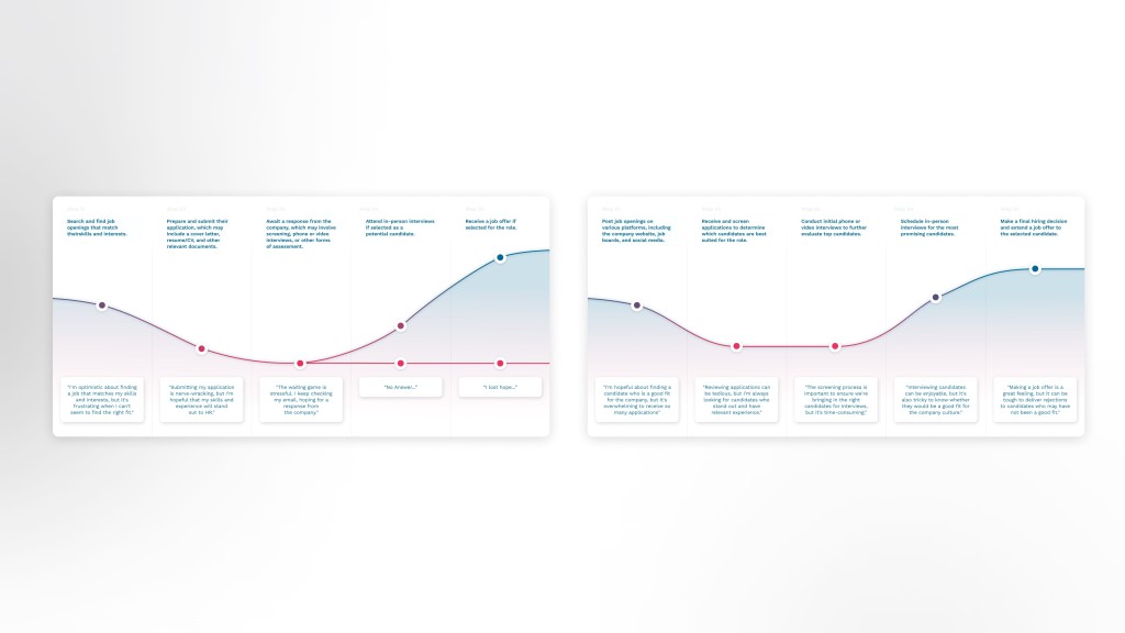
The existing product presents potential solutions for the issues identified during the research phase. Ohaey has introduced an innovative approach to handling open job applications with a streamlined 90-second application process. While the product is heading in the right direction, there appears to be a misalignment between the information requested and what's necessary.
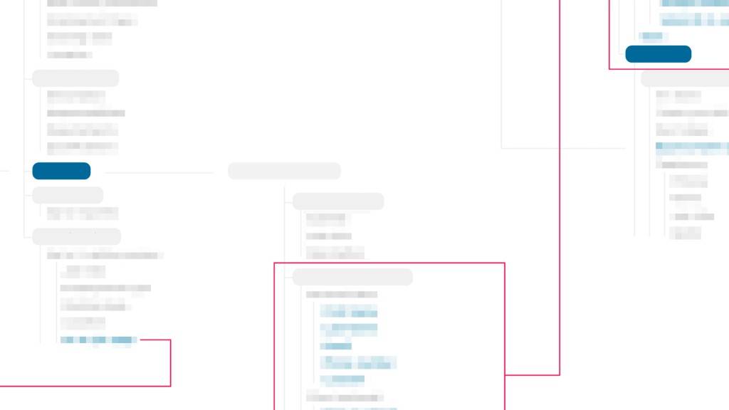
To gain a deeper understanding of the structural flaws, I translated the current mockups provided by Ohaey into an information architecture. This step enabled me to pinpoint several critical pain points.
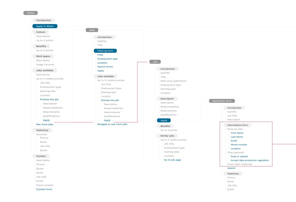
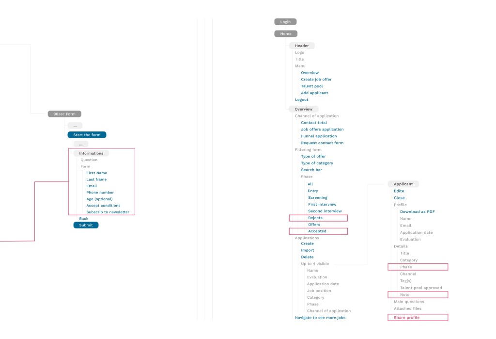
To facilitate the interaction between applicants and recruiters, several key improvements are needed. The initial concern highlighted by the information architecture was the inconsistency in the data collected between a standard application and the rapid 90-second application process. The disparity in information requested from candidates creates challenges for recruiters when attempting to match open job positions with these quicker applications. It also poses difficulties for any potential algorithm aimed at facilitating this process for recruiters.
The structural analysis also revealed certain areas that require further development. One such area is the management aspect for recruiters. Currently, there is no tracking system in place for managing profiles that have been accepted or rejected. Additionally, the management functionality lacks the capability to easily share profiles, which emerged as a crucial task during interviews with recruiters. Lastly, while profiles are meant to evolve throughout the application process, there are limited options for candidates to make easy edits to their profiles.
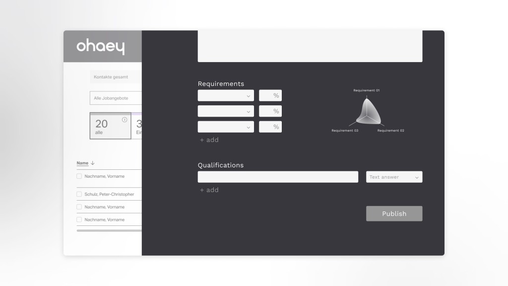
My role in this project was to provide constructive feedback to the client, outlining the necessary steps for improving their product. I proposed practical solutions through wireframes to address the identified pain points.
Firstly, I recommended a different approach to posting job offers. This new approach emphasizes visual feedback, which we found to be more engaging during our research. It encourages recruiters to clearly define their requirements and their importance. It also enhances the recruiter's ability to comprehend candidate responses through visual elements. I suggested making the required skills section more interactive and tailored to provide the specific information recruiters need, facilitating smoother virtual interactions.
Another key recommendation was to align the requested data in the 90-second application form with the same type of information collected through other application methods. This alignment enables the potential use of algorithms to sort applications directly to the appropriate departments.
Finally, I redesigned the profile section on the management platform to make sharing and editing easier for recruiters, addressing the requirements they identified during the interviews.
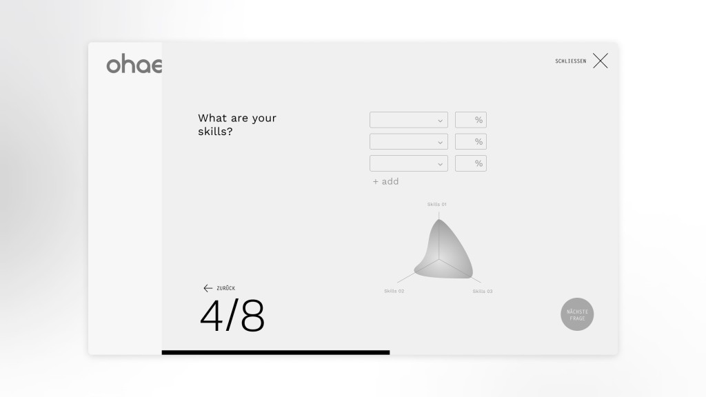
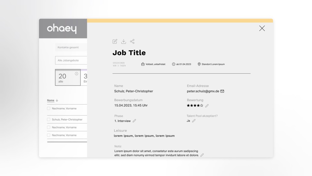
This project held significant personal interest for me for several reasons. Firstly, it provided a valuable learning opportunity as I worked with a fully developed product and deconstructed it to rebuild it from the ground up. Secondly, the subject matter resonated with me on a personal level. Like many of my colleagues, I've encountered the complexity of the job application process in our efforts to secure positions. Being able to contribute to facilitating a better interaction between recruiters and candidates was deeply meaningful.
From my perspective, the most significant question this project posed was the company's strategic positioning within the industry. This project carries immense potential to bring about a substantial shift in how we approach job applications. For Ohaey, a creative agency, embracing such a project could entail significant internal changes and innovations.